Lab sheet 8: Central Limit Theorem
Let \(X_1,X_2,\dots\) be a sequence of independent, identically distributed random variables, each with mean \(\mu\) and variance \(\sigma^2\). Then the distribution of \[\dfrac{X_1+X_2+\dots+X_n-n\mu}{\sigma\sqrt{n}}\] tends to the standard normal as \(n\to \infty\). That is, \[P\left(\dfrac{X_1+X_2+\dots+X_n-n\mu}{\sigma\sqrt{n}}\leq a \right)\to \dfrac{1}{\sqrt{2\pi}} \int_{-\infty}^{a}e^{-x^2/2}dx\] as \(n\to\infty\).
In other words, the central limit theorem tells us that if the population distribution has mean \(\mu\) and standard deviation \(\sigma\), then the sampling distribution of the mean also has mean \(\mu\), and the standard error of the mean is \[ \mbox{S} = \frac{\sigma}{ \sqrt{n} }. \] We can see this experimentally. We will consider some known distribution and do the experiments.
Normal distribution
# mean and standard deviation of normal distribution
m <- 0
s <- 1
# folowing fuction is written to show the histogram plot of sample mean.
mean.histplot <- function(n,N=50000) {
  # n - sample size
    X <- matrix(rnorm(n*N,m,s),n,N)
    X <- colMeans(X)
    # generate histogram
    hist( X, breaks="Sturges", border="white", freq=FALSE,
            col="blue",
            xlab="Sample mean", ylab="", xlim=c(-3.5,3.5),
            main=paste("Sample size =",n), axes=FALSE,
            font.main=1
        )
    box()
    axis(1)
    # plot N(mu,sigma/sqrt(n))
    lines( x <- seq(-3.0,3.0,.01), dnorm(x,m,s/sqrt(n)),
    lwd=2, col="black", type="l"
    )
}

mean.histplot(1)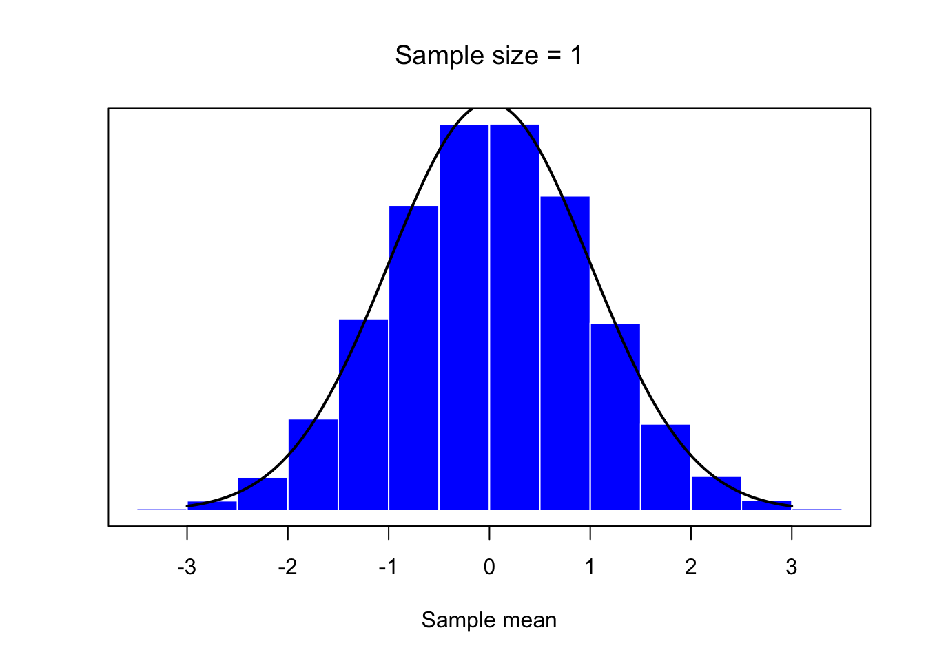
mean.histplot(4)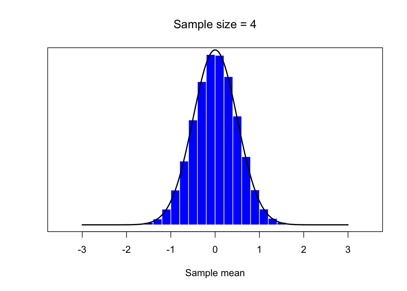
mean.histplot(30)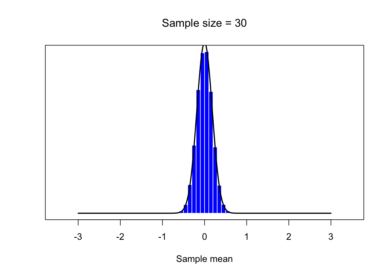
Poission distribution
# Lambda, mean and standard deviation
L<-2
m <- L
s <- sqrt(L)

# define function to draw a plot
mean.histplot <- function(n,N=50000) {
  # n - sample size
    X <- matrix(rpois(n*N,L),n,N)
    X <- colMeans(X)
    # generate histogram
    hist( X, breaks="Sturges", border="white", freq=FALSE,
            col="blue",
            xlab="Sample mean", ylab="",
            main=paste("Sample size =",n), axes=FALSE,
            font.main=1
        )
    box()
    axis(1)
    # plot N(mu,sigma/sqrt(n))
    lines( x <- seq(-30.0,30.0,.01), dnorm(x,m,s/sqrt(n)),
    lwd=2, col="black", type="l"
    )
}

mean.histplot(1)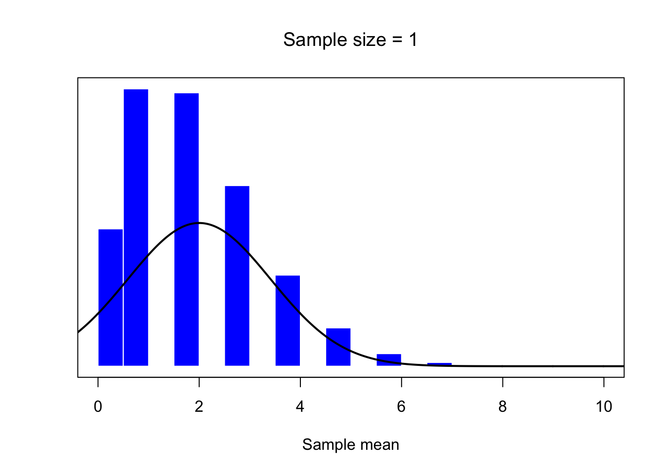
mean.histplot(4)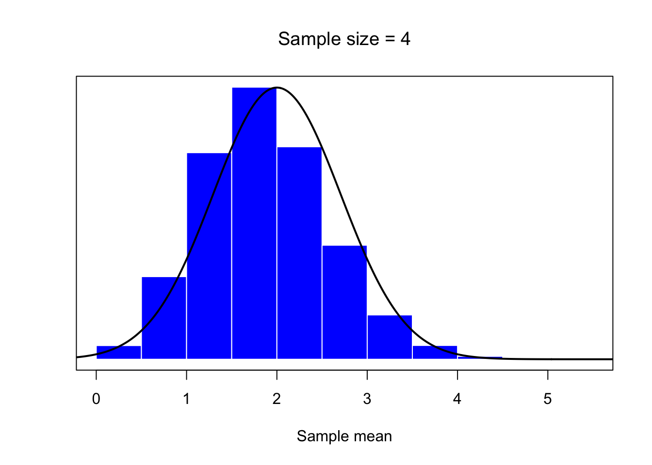
mean.histplot(30)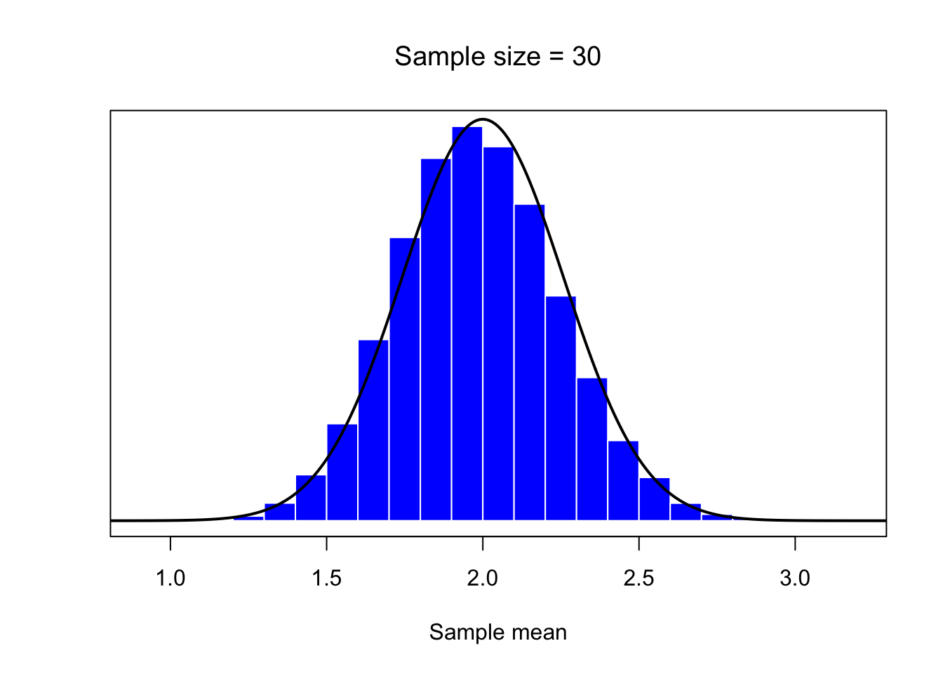
Exponential distribution
# Lambda, mean and standard deviation
L<-3.5
m <- 1/L
s <- 1/L
# define function to draw a plot
mean.histplot <- function(n,N=50000) {
  # n - sample size
    X <- matrix(rexp(n*N,rate=L),n,N)
    X <- colMeans(X)
    # generate histogram
    hist( X, breaks="Sturges", border="white", freq=FALSE,
            col="blue",
            xlab="Sample mean", ylab="",
            main=paste("Sample size =",n), axes=FALSE,
            font.main=1
        )
    box()
    axis(1)
    # plot N(mu,sigma/sqrt(n))
    lines( x <- seq(-30.0,30.0,.01), dnorm(x,m,s/sqrt(n)),
    lwd=2, col="black", type="l"
    )
}
mean.histplot(1)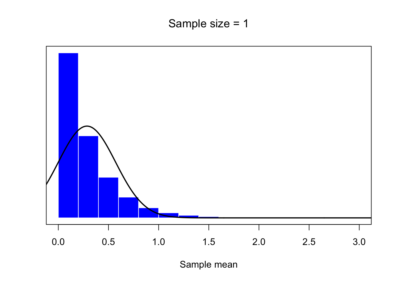
mean.histplot(4)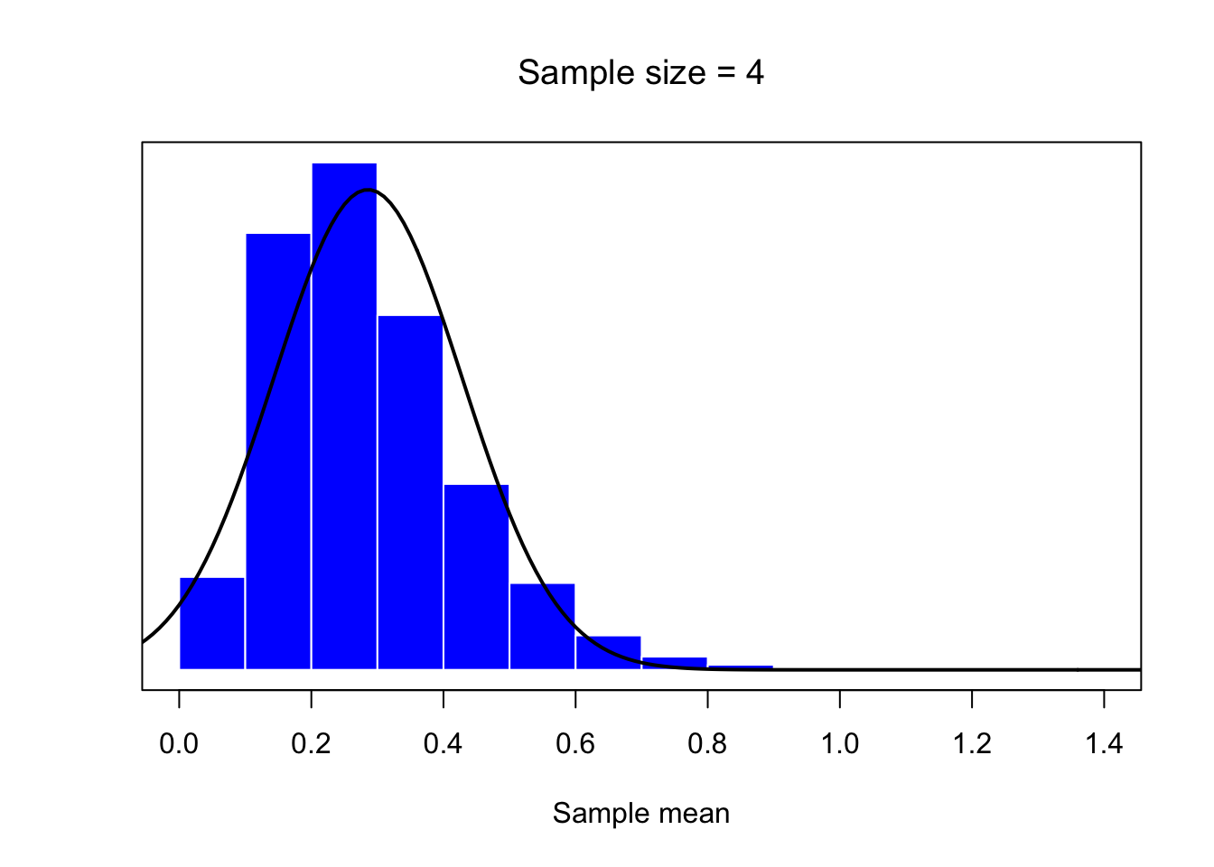
mean.histplot(30)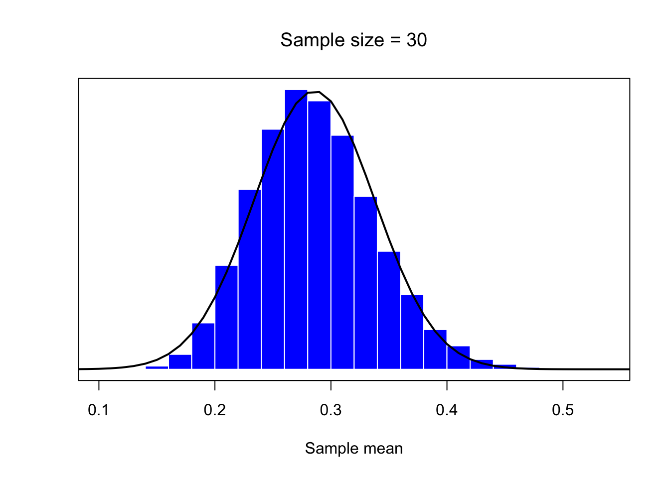
Binomial distribution
# parameters
n1<- 10
p <- 0.7
q <- 1-p
m <- n1*p
s <- sqrt(n1*p*q)
# define function to draw a plot
mean.histplot <- function(n,N=50000) {
  # n - sample size
    X <- matrix(rbinom(n*N,size=n1,prob = p),n,N)
    X <- colMeans(X)
    # generate histogram
    hist( X, breaks="Sturges", border="white", freq=FALSE,
            col="blue",
            xlab="Sample mean", ylab="",
            main=paste("Sample size =",n), axes=FALSE,
            font.main=1
        )
    box()
    axis(1)
    # plot N(mu,sigma/sqrt(n))
    lines( x <- seq(-30.0,30.0,.01), dnorm(x,m,s/sqrt(n)),
    lwd=2, col="black", type="l"
    )
}
mean.histplot(1)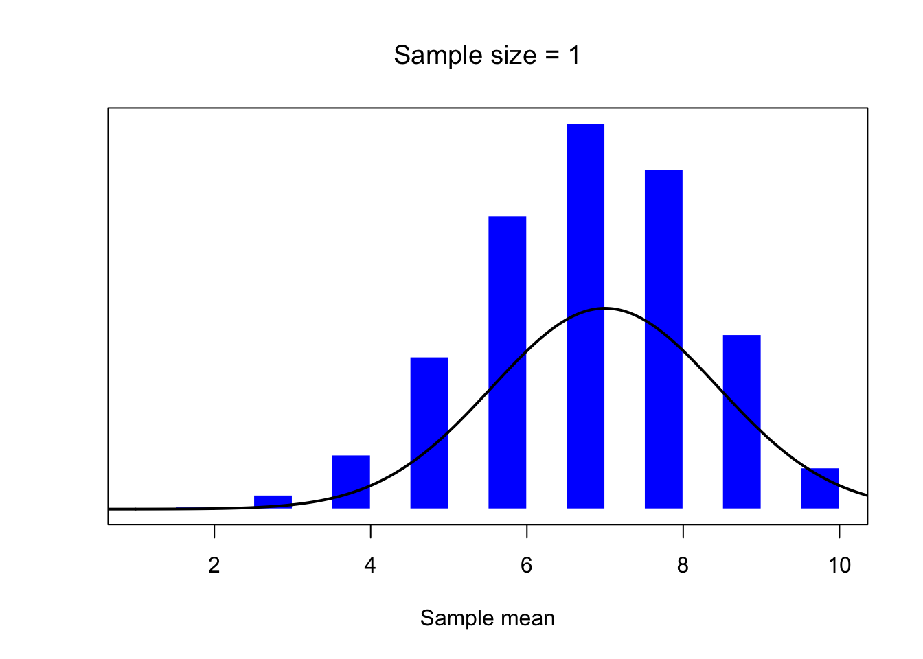
mean.histplot(4)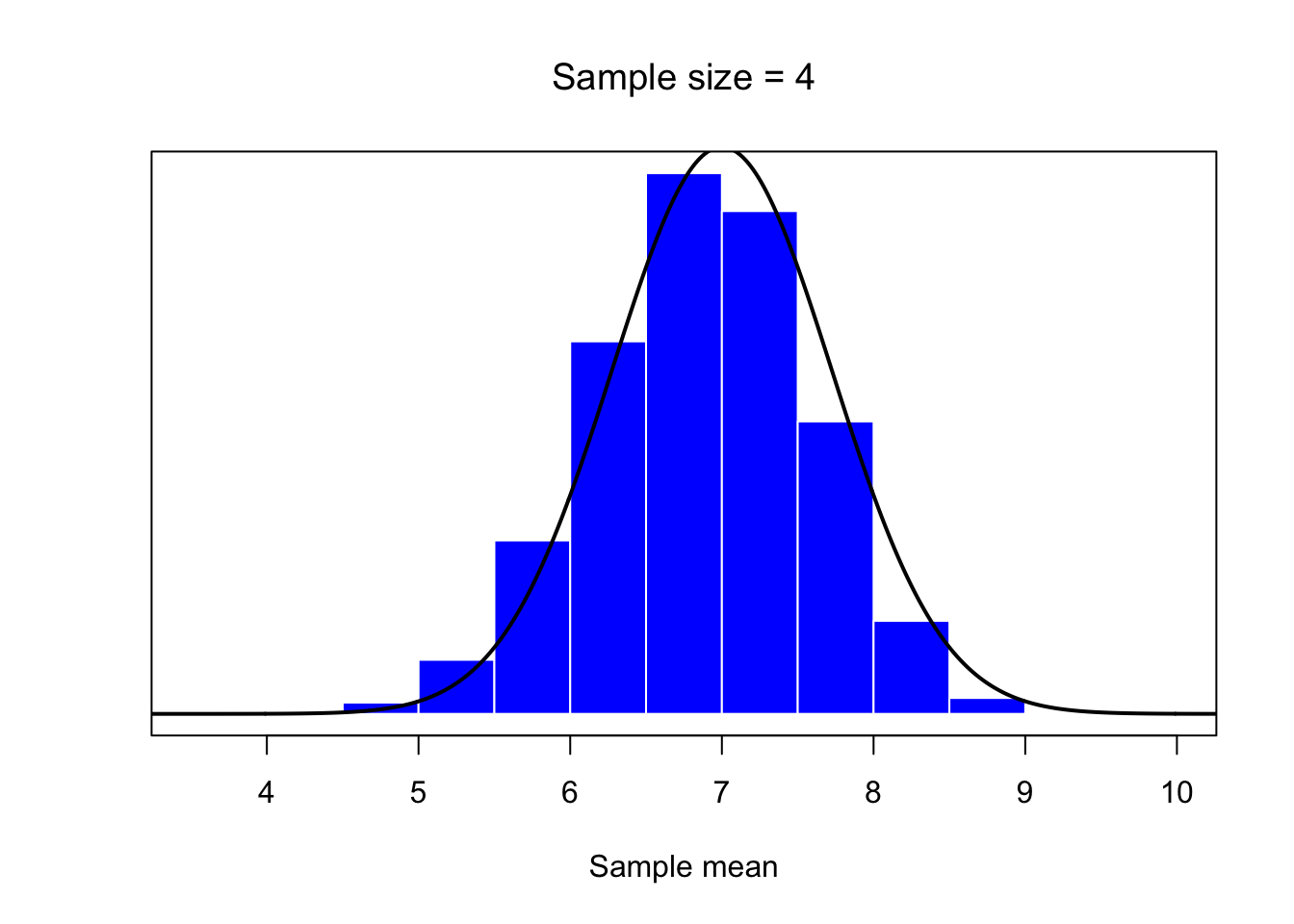
mean.histplot(30)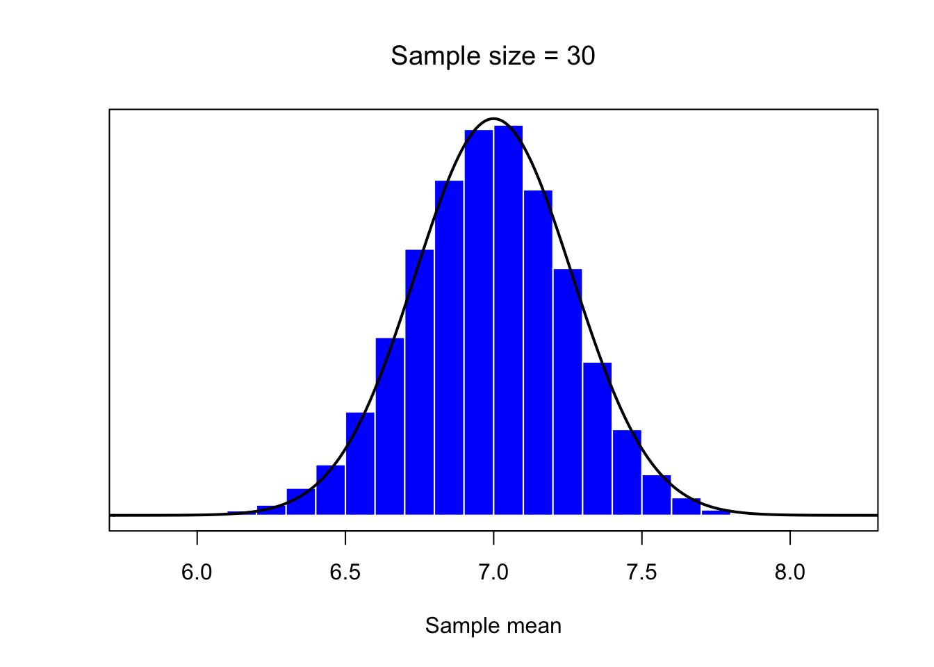
# parameters
n1<- 10
p <- 0.7
q <- 1-p
m <- n1*p
s <- sqrt(n1*p*q)
# define function to draw a plot
sample.mean <- function(n,N=50000) {
  # n - sample size
    X <- matrix(rbinom(n*N,size=n1,prob = p),n,N)
    X <- colMeans(X)
    return(X)
}
trace0 <- sample.mean(1)
trace1 <- sample.mean(4)
trace2 <- sample.mean(30)
library(plotly)

fig <- plot_ly(x = trace0, type = "histogram",name='Sample size = 1')
fig <- fig %>% add_histogram(x = ~trace1,name='Sample size = 4')
fig <- fig %>% add_histogram(x = ~trace2,name='Sample size = 30')
fig <- fig %>% layout(barmode = "overlay", xaxis = list(title = 'Sample mean'))
fig