Lab Sheet 4: Basics of data analysis in R and a Simple Sentiment Analysis
Lab Sheet 4a: Basics of data analysis in R
Introduction
In this section, we will explore basic data transformation techniques using the dplyr package with the nycflights13 dataset, which contains information about all flights that departed from NYC in 2013.
Load Necessary Packages
# Load required packages
library(nycflights13)  # Dataset containing flight data
library(tidyverse)     # A collection of R packages for data manipulation and visualization
Data Transformation with dplyr
1. Filtering Data
We can use the filter() function to subset our data based on certain conditions.
# Filter flights that had a departure delay greater than 120 minutes
flights |>
  filter(dep_delay > 120)
# Flights that departed on January 1
flights |>
filter(month == 1 & day == 1)# Flights that departed in November or December
flights |>
filter(month == 11 | month == 12)# Another way to filter for November or December
flights |>
filter(month %in% c(11, 12))2. Arranging Data
The arrange() function helps us sort the data.
# Arrange flights by year, month, day, and departure time
flights |>
  arrange(year, month, day, dep_time)
# Arrange flights by departure delay in descending order
flights |>
arrange(desc(dep_delay))3. Distinct Values
To find unique values in our dataset, we can use distinct().
# Remove duplicate rows from the dataset
flights |>
  distinct()
# Keep only unique combinations of origin and destination
flights |>
distinct(origin, dest, .keep_all = TRUE)# Count unique combinations of origin and destination
flights |>
count(origin, dest, sort = TRUE)4. Creating New Variables with mutate()
The mutate() function allows us to create new variables.
# Calculate the gain in minutes and speed of flights
flights |>
  mutate(
    gain = dep_delay - arr_delay,
    speed = distance / air_time * 60  # Speed in miles per hour
  )
5. Using Pipes
The pipe operator (|>) lets us chain commands together for clearer and more concise code.
# Filter for flights to IAH, calculate speed, and arrange by speed
flights |>
  filter(dest == "IAH") |>
  mutate(speed = distance / air_time * 60) |>
  select(year:day, dep_time, carrier, flight, speed) |>
  arrange(desc(speed))
6. Grouping Data
Grouping data allows us to perform calculations on subsets of the data.
# Group by month and calculate average departure delay
flights |>
  group_by(month) |>
  summarize(
    avg_delay = mean(dep_delay, na.rm = TRUE)  # Handle missing values
  )
Conclusion
In this section, we’ve covered essential data transformation techniques using dplyr. These skills are foundational for data analysis in R.
Lab Sheet 4b: A Simple Sentiment Analysis
Introduction
In this section, we will perform sentiment analysis on a news article using the tidytext and rvest packages. We will scrape the article, process the text, and visualize the results.
Load Necessary Packages
# Load required packages for sentiment analysis
library(tidytext)   # Text mining
library(rvest)      # Web scraping
library(textdata)   # Sentiment datasets
library(wordcloud)  # Word cloud visualization
library(RColorBrewer) # Color palettes for visualizations
library(wordcloud2) # Interactive word clouds
Scrape and Extract Text from a Website
We will use the rvest package to scrape a news article.
# Define the URL of the article
url <- 'https://indianexpress.com/article/technology/science/nobel-prize-physics-john-hopfield-geoffrey-hinton-9609849/'

# Read the HTML content from the webpage
news <- read_html(url)
Extract Text
We will extract all the paragraphs from the article and store them in a tibble.
# Scrape and extract all paragraphs (<p>) and store them in a tibble
text <- tibble(
  news %>%
    html_elements('p') %>%  # Select all paragraph elements (<p>) from the HTML content
    html_text()  # Extract text from the paragraph elements
) %>%
  rename('text' = 1)  # Rename the column to "text"
Get Sentiments
We will load the NRC sentiment dataset, which categorizes words into different emotions.
# Load sentiment data
sentiments <- get_sentiments('nrc')
Tokenize the Text
We will split the text into individual words for analysis.
# Separate all texts into individual words
tokens <- text %>%
  unnest_tokens(input = text, output = word) %>%
  filter(!grepl('[0-9]', word)) # Remove numbers
Remove Stop-Words and Count Frequency
We will remove common stop-words and count the frequency of each word.
# Remove stop-words and count the frequency of each word
word_freq <- tokens %>%
  anti_join(stop_words) %>%
  count(word, sort=TRUE)
## Joining with `by = join_by(word)`Visualize Word Frequencies with Word Clouds
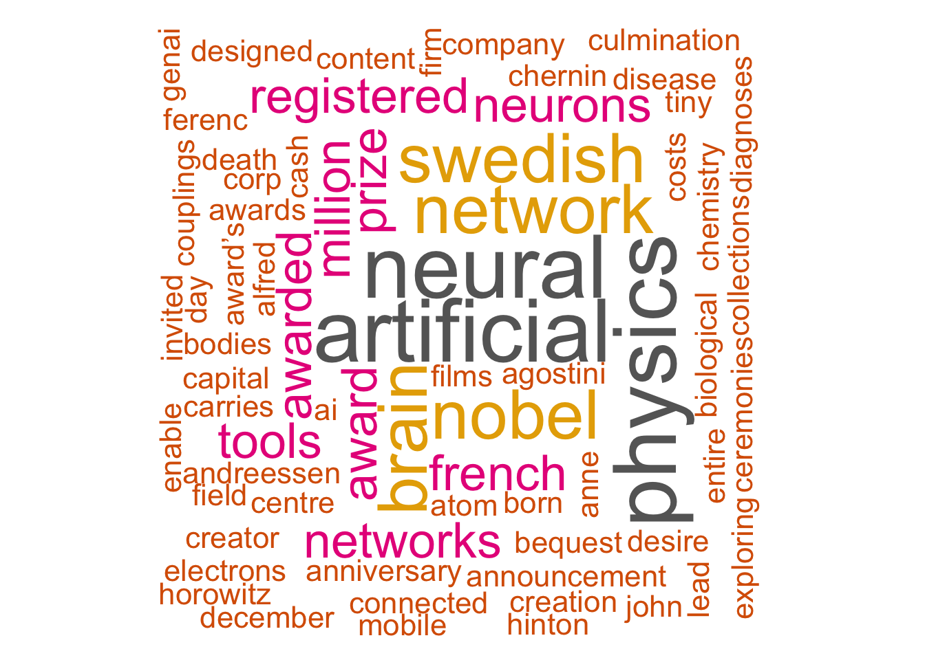
We can visualize the most frequent words using word clouds.
# Set seed for reproducibility
set.seed(1234)

# Basic word cloud
wordcloud(words = word_freq$word,
          freq = word_freq$n,
          min.freq = 1,
          max.words=150,
          random.order=FALSE,
          rot.per=0.40,
          colors=brewer.pal(9, "Dark2")
)
# Interactive word cloud
wordcloud2(
  data = word_freq,
  color = "random-dark",  # Color scheme
  backgroundColor = "white",  # Background color
  fontFamily = "Arial",  # Font family
  minRotation = -pi/4,  # Minimum rotation angle
  maxRotation = pi/4   # Maximum rotation angle
)
Count Sentiment Scores
Next, we will associate each word with its sentiment score.
# Count the frequency of sentiments associated with each word
freq_count <- tokens %>%
  inner_join(sentiments, by='word', multiple = "all") %>%
  count(sentiment, sort = TRUE)
Plot the Sentiment Frequencies
Finally, we will visualize the sentiment frequencies using a bar plot.
# Create a bar plot of sentiment frequencies
gg <- freq_count %>%
  ggplot(aes(x= sentiment, y= n, fill= sentiment)) +
  geom_col(show.legend = FALSE) +
  geom_text(aes(label=n), size=5, position = position_stack(vjust = 0.5)) +  # Center labels
  labs(x= 'Sentiment', y= 'Frequency') +
  ggtitle('Sentiment Frequencies from Article') +
  theme_minimal()  # Clean theme
gg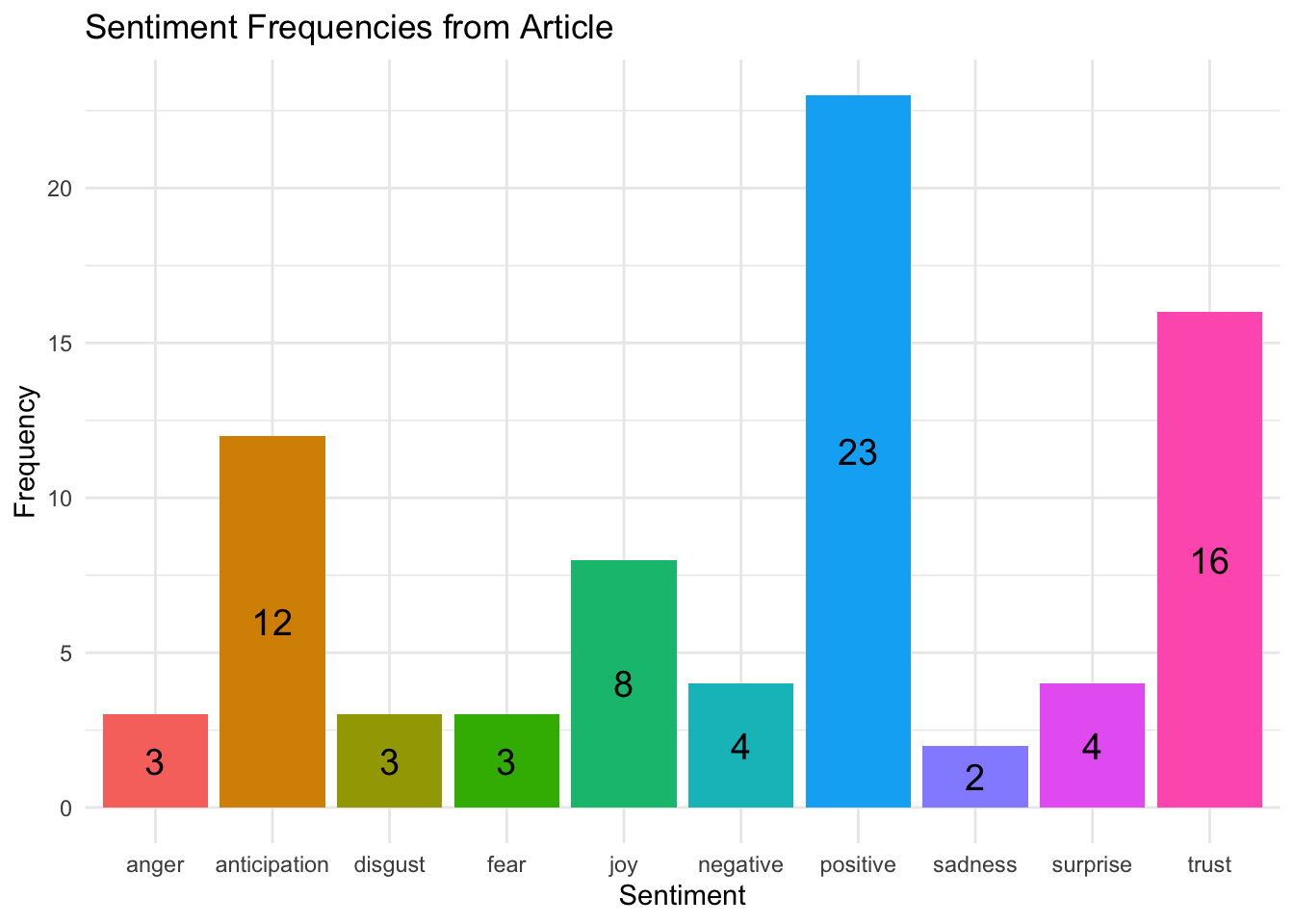
Conclusion
In this section, we performed sentiment analysis on a news article, demonstrating how to scrape text data, analyze it for sentiment, and visualize the results.
Additional Notes
- Ensure you have all the necessary packages installed before running the scripts.
- Explore additional datasets and articles for further practice with sentiment analysis.